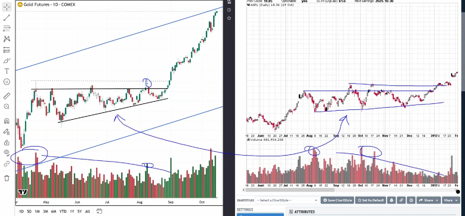
Receive all the latest news from Wyckoff Analytics! Weekly notifications about upcoming events, as well as market updates, newly posted articles and videos, delivered straight to your inbox.
Wyckoff Analytics is committed to protecting your privacy. We do not sell, lease or otherwise provide your personal information to anyone, ever. You can unsubscribe at any time from this list.
The current gold reaccumulation phase bears a striking resemblance to Apple’s (AAPL) structure back in 2012. For traders and investors studying gold breakout patterns, this comparison offers valuable insights. By examining these two assets side by side, we can catch important nuances in how similar structures develop.
When analyzing the way the Apple trade unfolded in 2012, the structural similarities to today’s gold chart become immediately apparent. The first step is examining the price structure that preceded the action. Looking at both charts, there’s a resemblance in their patterns.
The volume distribution patterns reveal interesting observations. In the AAPL 2012 chart, the majority of volume was concentrated in specific areas. Gold’s current structure shows a bit more volume distribution in comparison. Both assets exhibited an overall decline in their respective phases.
One of the most notable observations is the spike at resistance. This resistance test is visible in the structure. The pattern includes that critical spike at resistance followed by breakout volume. These breakout volume signatures with spikes on the breakouts are essential markers worth examining.
Breakout volume analysis is a key part of this comparison. The spikes on breakouts are visible in both structures. This is the breakout in AAPL, and this is the breakout in gold—looking at where these volume spikes occur on the breakouts.
The focus is on identifying this specific point: where supply is going to increase and not going to produce significant reaction. The goal is to see supply increases that immediately have no follow-through. This demonstrates the type of strength of the move being analyzed.
The analysis points to that trend and this bar. Looking at that specific bar reveals the structure being examined in both the AAPL 2012 chart and the current gold chart.
The last reaccumulation phase in gold resembles the structure of AAPL in 2012. By studying the two assets side by side, important nuances can be caught in how these structures develop and what elements they share in common.
Disclaimer: This content is for educational purposes only and should not be considered financial advice.
Trade with (not against) institutions!
|